
 Log in


Matching colors between mockups and photos is critical for ensuring that your digital designs align with the final product. When colors don’t match, it can lead to customer disappointment, increased returns, and damage to your brand’s credibility. Here’s what you need to know:
- Lighting and Camera Settings: Natural and artificial lighting, white balance, and exposure can alter how colors appear in photos.
- Monitor Calibration: Uncalibrated monitors or differences in display technology can distort color accuracy.
- Photoshop Tools: Use features like Match Color, Curves, and the Eyedropper Tool for precise adjustments.
- Testing: Verify colors across devices, lighting conditions, and print tests to ensure consistency.
How to Color Match Images in Photoshop
Common Causes of Color Differences
If you’ve ever noticed a big difference between the colors in your mockups and the final product photos, you’re not alone. These discrepancies often stem from a mix of technical and environmental factors that can throw off color accuracy without you even realizing it. Let’s break down some of the key culprits, starting with lighting and camera settings.
Lighting and Camera Settings
Natural lighting is a major factor. The way colors appear in photos can shift dramatically depending on the time of day. For example, a red hoodie photographed in bright midday sunlight will look much different than the same hoodie shot during the warm, golden light of late afternoon. This happens because the color temperature of light changes throughout the day, influencing how fabrics reflect and absorb light.
Your camera’s white balance settings also play a critical role. If your camera is set to "auto white balance", it tries to guess the correct color temperature, but it doesn’t always get it right. Combine that with exposure settings, and you’ve got another layer of potential color shifts. Overexposed photos can wash out darker tones, while underexposed shots make colors appear overly dark and saturated.
Indoor artificial lighting comes with its own challenges. Fluorescent lights often add a greenish tint, tungsten bulbs bring a yellow-orange cast, and LED lights vary depending on their specific color temperature. The angle and intensity of your lighting setup also impact the final look. Harsh, direct lighting can create shadows that exaggerate saturation in some areas while washing out others. On the other hand, soft, diffused lighting provides more even color representation but might lack the dramatic effect you had in your digital designs.
Monitor Calibration and Display Differences
Your monitor’s calibration is another big factor in color accuracy. Most monitors are calibrated for brightness and visual appeal straight out of the box, not for precise color accuracy. This means the bold red you see on your screen might lean more orange or pink than you realize.
Different display technologies add to the challenge. OLED screens tend to showcase deeper blacks and more vibrant colors compared to LCD monitors. Meanwhile, IPS panels are generally better at handling color accuracy than TN panels, but even these can vary widely between brands and models.
Your workspace lighting and monitor brightness settings also influence how you perceive colors. A screen that’s too bright can make colors look washed out, while one that’s too dim can make them appear darker and more muted. Bright overhead lights or reflections on your screen can further distort color perception, especially in poorly lit rooms.
Over time, age and wear take a toll on your display equipment. Older monitors often develop a yellowish tint, and their ability to reproduce accurate colors diminishes. So, what looked like a perfect match six months ago might now be noticeably off.
Finally, color profiles and color spaces can create inconsistencies. If your monitor is set to sRGB but your mockup files use Adobe RGB or another color space, you’ll likely see color shifts. These mismatches often go unnoticed until you compare your digital designs to the physical product.
Even the viewing angle of your monitor can make a difference. Colors can shift dramatically if you’re not looking at the screen straight-on. This issue is especially noticeable with lower-quality monitors that struggle with consistent color performance at wider angles.
Next, we’ll dive into how organizing your files in Photoshop can help tackle some of these challenges.
Setting Up Your Files in Photoshop
Getting your Photoshop files organized is key when comparing mockups and photos side by side. This setup helps ensure accurate color matching and keeps your workflow smooth.
Importing and Organizing Files
Start by creating a new document with dimensions of 3000 x 2000 pixels at 300 DPI. This size works well for both your mockup and reference photo.
Open your mockup file first. If you're using a PSD mockup template, simply load it into Photoshop. For other formats like PNG or JPEG, place the file into your document. Position the mockup on the left side of the canvas, leaving the right side for your reference photo.
Next, import your product photo and place it on the right. To resize either image, use Ctrl+T (or Cmd+T on a Mac) and hold Shift to keep the proportions intact.
Before moving forward, make sure both files are set to RGB Color mode (go to Image > Mode). Files in CMYK mode can display colors differently, which could affect your color adjustments. If conversion to RGB is needed, do it now.
Organize your layers for better control. Name and group them - for example, use names like "T-shirt Base" or "Design Artwork." Keep a backup by duplicating the original layers. Create separate layer groups for "Mockup Elements" and "Reference Photo" to make adjustments easier down the line.
Lastly, ensure you're working under neutral lighting conditions. Your monitor should be the main light source in your workspace, as this helps display colors more accurately.
Once your files are set up, you’re ready to move on to selecting a high-quality template for precise color matching.
Choosing High-Quality Mockup Templates
The way you organize your files is just the first step. Choosing the right mockup template is equally important for achieving accurate color results. A high-resolution template with layered editing options provides the flexibility you need for professional-level color matching.
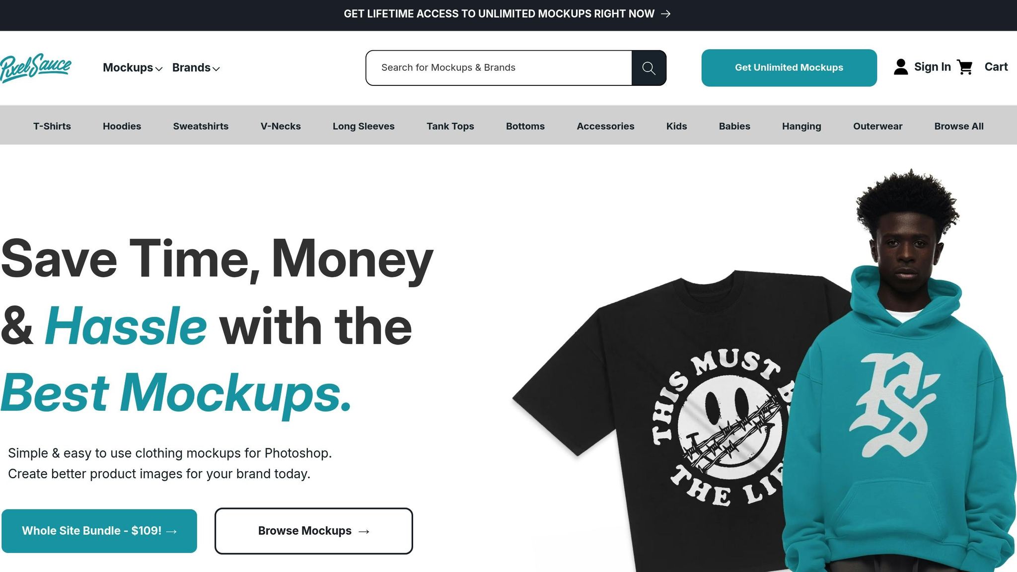
Look for mockups that include separate layers for fabric textures, shadows, highlights, and design placement. This gives you precise control over every element. For example, Pixel Sauce's mockup templates are known for their attention to color accuracy. These templates feature color libraries that match real fabric shades, reducing guesswork during color adjustments. They also include 3D artwork mapping, which realistically simulates how designs will look on actual garments, including fabric draping and texture interaction.
When selecting a template, opt for those shot under soft, even lighting. Neutral lighting makes it easier to adjust colors without introducing unwanted tones. Templates with layered structures are essential - this allows you to independently adjust the base fabric color, design elements, shadows, and highlights. Avoid templates that flatten these elements into a single layer, as this limits your ability to make precise edits.
Pay attention to the resolution and dimensions of the template. A professional-grade mockup should measure at least 3000 pixels on the longest side and have a 300 DPI resolution. Lower resolution templates can appear pixelated when you zoom in, making detailed color adjustments challenging.
Another feature to look for is smart object integration. Smart objects let you double-click and edit designs in a separate document, allowing you to tweak design colors independently from the fabric background. This gives you much more control over the final look.
Finally, check how the template’s layers are organized. High-quality templates will have clearly labeled layers, well-organized groups, and sometimes even helpful notes from the creator. Some templates also include color swatches or reference guides, which can be a huge help in identifying which layers control specific elements of the design.
Color Matching Methods in Photoshop
Once your files are ready and you've chosen a solid template, it's time to start matching colors in Photoshop. The software provides several tools to ensure your mockups and product photos have a consistent look.
Using the Match Color Command
Photoshop's Match Color command is a handy tool for transferring color tones between images. You can use it to match colors across multiple images, within layers of the same document, or even between specific selections.
Here’s how to use it:
- Open the target image (your mockup) in Photoshop.
- Navigate to Image > Adjustments > Match Color.
- In the dialog box, go to the Source menu under the Image Statistics section and select the product photo you want to match. If you're working within the same document, choose it as the source and specify a particular layer using the Layer menu - or select Merged to pull colors from all visible layers.
The adjustment sliders in the Match Color dialog let you fine-tune your results:
- Luminance slider: Adjusts brightness (1 to 200, with 100 as the default). Move it left to darken or right to brighten your mockup.
- Color Intensity slider: Controls saturation. Lower values reduce vibrancy, even creating a grayscale effect, while higher values make colors more vivid.
- Fade slider: Lets you blend the adjustment with the original image for a more natural look.
If your image has an unwanted color cast, enable the Neutralize option to help eliminate it. Keep the Preview option checked to see changes in real time.
When the automatic adjustments don’t quite work, manual methods can help refine the results.
Manual Adjustments with Curves
If the Match Color tool doesn’t deliver the exact look you’re after, Curves adjustment layers can give you more control over tonal and color balance. To get started, create a new Curves adjustment layer from the Layers panel. The Curves dialog shows a diagonal line representing your image’s tonal range - from shadows (bottom left) to highlights (top right).
Here’s how to adjust:
- Use the black point eyedropper to set the darkest part of the image that should retain detail, and the white point eyedropper for the brightest part. This helps establish proper contrast.
- For color adjustments, switch to individual color channels (Red, Green, or Blue) using the dropdown menu. For example, if your mockup looks too warm, select the Blue channel and slightly lift the midtones to cool it down.
Make small, precise changes for the best results.
Eyedropper Tool for Pixel-Level Precision
For pinpoint accuracy, the Eyedropper Tool combined with the Info Panel is incredibly effective. Open the Info Panel by going to Window > Info, which displays precise RGB values for any pixel you sample. Set your Eyedropper’s sample size to 3×3 Average or 5×5 Average to avoid inconsistencies caused by single pixels.
Here’s how to use it:
- Click on a representative color area in your reference photo and note its RGB values.
- Compare these to the same area in your mockup.
- To adjust, create a Color Balance or Selective Color adjustment layer and tweak the sliders until the RGB values match as closely as possible.
For even better control, use the Color Sampler Tool to place up to four sample points on your image. These points will display their RGB values in the Info Panel, allowing you to monitor multiple areas as you make adjustments.
If you’re working with fabric textures, sample multiple areas to account for natural variations in color. This level of precision is especially useful when using Pixel Sauce mockup templates, where small details can make a big difference.
sbb-itb-23fab5f
Checking and Verifying Colors
Once you've adjusted your colors, it's time to test your work. Colors that look perfect on your screen might appear completely different on other devices or under different lighting conditions. To ensure consistency, it’s important to verify your color adjustments across various scenarios. Here’s how you can assess your color matching effectively.
Testing Under Different Conditions
Colors can shift depending on the device, lighting, or even the time of day. To catch potential inconsistencies before your work reaches the audience, test your color-matched images on multiple devices.
Start by viewing your work on a variety of screens. A color that looks great on your design monitor might appear overly warm on a laptop or too cool on a tablet. Try your images on phones, tablets, and additional monitors to see how they translate across different displays.
Lighting is another factor that affects color perception. Test your images in various lighting environments - bright office fluorescents, dim evening light, or natural daylight by a window. This helps you understand how your colors will appear in real-world settings.
If your project will eventually be printed, print a small test version. Colors often behave differently on paper than they do on-screen, and catching these variations early can prevent expensive reprints later.
For digital simulations, use Photoshop's soft proofing feature (View > Proof Setup) with profiles like sRGB or Adobe RGB to preview how your work will appear under different output conditions.
Using Numerical Color Data
While your eyes are great tools for judging color, they can be influenced by surrounding colors, lighting, or even fatigue. That’s where numerical color data comes in - it offers an objective way to verify your work.
Use the Info Panel and Color Sampler Tool in Photoshop to record RGB values from key areas of your image. Aim for differences within 5–10 points per channel to ensure consistency. For example, if a reference photo shows an RGB value of 120, 85, 95 in a specific area, your mockup should ideally stay within 115–125, 80–90, and 90–100 for those channels.
Compare histograms to check the overall tonal balance of your images. If your reference image has a well-balanced histogram but your mockup shows heavy shadows or highlights, further adjustments may be needed. Histograms can help you spot tonal inconsistencies that might not be immediately visible.
For precise alignment, use guides to match corresponding areas in your images, then sample colors from identical positions. If you're working with Pixel Sauce templates, their built-in color libraries are a great resource. Sampling from these swatches ensures your colors stay within the intended range while remaining accurate to your source material.
Finally, record your RGB values for future use. Consistent numerical targets save time and ensure uniformity if you need to create additional mockups or variations down the line. This simple step can streamline your workflow and maintain quality across projects.
How Pixel Sauce Simplifies Color Matching
Pixel Sauce enhances your Photoshop workflow with a robust mockup library that prioritizes precision and ease of use. By building on the detailed file setup and color matching strategies outlined earlier, it pushes accuracy to the next level.
Precision in Color Libraries
Pixel Sauce's color libraries are crafted to ensure exact color matching for apparel mockups. These libraries include specific colors and fabric swatches for popular brands like AS Colour, making it easy to match your designs to actual products. You can either input precise color codes or choose from predefined swatches tied to each garment's brand and style.
"We include complete sets of colors/fabrics with our mockups making them the most accurate mockups anywhere." - Mock It
"Mock It provides intuitive color adjustment features to help you achieve accurate color representation. With options to either use a color code tool, or select the actual colors that the brand and style actually uses for the garment you have decided on. Use these tools to ensure your mockup aligns with your design vision and accurately represents the intended color palette." - Mock It
This attention to detail helps build trust with customers. When mockups mirror real-world designs, customers feel more confident about their purchases, knowing exactly what to expect.
Advanced Editing and 3D Artwork Integration
Pixel Sauce mockups offer non-destructive layered editing, giving you control over fabric colors, shadows, and highlights independently. The 3D artwork mapping feature takes realism to another level by seamlessly blending your designs with garment textures, folds, and contours. Using smart objects and displacement maps, this tool ensures your design adapts to the fabric's natural look and lighting, creating visuals that resemble professional photography.
With these tools, Pixel Sauce makes color matching and design integration effortless, delivering mockups that are both visually striking and incredibly accurate.
Key Takeaways
Getting consistent color matching right is essential for building your brand’s reputation and earning customer trust. When your mockups reflect the actual products accurately, customers know what to expect. This not only boosts satisfaction but also helps cut down on unnecessary returns.
To tackle the technical challenges of color matching, start by recognizing the key factors that influence color - lighting, camera settings, and monitor calibration. Address these variables in Photoshop to lay the groundwork for accurate results.
Photoshop offers tools like Match Color for quick fixes, while Curves and the Eyedropper Tool allow for more precise adjustments. You can even use blending modes like Multiply to tweak colors without losing texture detail.
Always test your work under different lighting conditions and double-check numerical color values (like RGB or HEX codes). This methodical approach ensures your colors stay consistent and prevents costly errors that could impact your brand’s image.
For added efficiency, use high-quality templates. Platforms such as Pixel Sauce simplify the process with layered editing, precise color libraries, and 3D artwork mapping features. These tools turn a time-consuming task into a streamlined, reliable workflow.
FAQs
How can I calibrate my monitor for accurate color matching in Photoshop?
How to Achieve Accurate Color Matching
Getting accurate color matching starts with calibrating your monitor. The best way to do this is by using a hardware calibration tool, such as a colorimeter or spectrophotometer. These devices help fine-tune your display settings to deliver precise color accuracy. Trusted brands like Spyder and X-Rite offer reliable options for this purpose.
If you don’t have access to a hardware tool, don’t worry - your operating system likely has built-in calibration tools. For instance, Windows includes the Display Color Calibration feature, which walks you through adjusting brightness, contrast, and color balance step by step.
Taking the time to calibrate your monitor ensures that the colors you see on-screen match the real-world colors of your products or designs. It’s a crucial step for anyone working with mockups or product photography.
How can I ensure colors in my mockups match real-life product photos accurately?
To ensure that the colors in your mockups closely match real-life product photos, start by regularly calibrating your monitor. This step helps maintain a consistent and accurate color display. In Photoshop, you can use standard color profiles like sRGB or Adobe RGB by navigating to Edit > Color Settings. These profiles help keep colors uniform across different devices and outputs.
When working on mockups, tools such as gradient maps and adjustment layers can be incredibly useful. They allow you to fine-tune color tones and adjust lighting, ensuring your designs appear consistent no matter the screen or lighting conditions. If you're using high-quality templates, like those from platforms such as Pixel Sauce, you’ll benefit from features like layered editing and built-in color libraries, which make it easier to achieve polished, professional results.
Why should I use high-quality mockup templates for color matching, and what features make them effective?
Using top-notch mockup templates can make a big difference when it comes to accurate color matching. These templates provide realistic visuals that help spot and correct color inconsistencies early in the design process. This way, your final product aligns with your creative vision and meets customer expectations.
When choosing a mockup template, focus on features like layered editing for fine-tuning, color libraries that align with manufacturer standards, and tools for dynamic color adjustments. These tools allow you to create mockups that closely mirror the actual product, helping you save time and avoid expensive errors.