 Log in


Photoshop and Photopea templates can simplify design work, but they often come with challenges that disrupt workflows. Issues like compatibility problems, broken smart objects, mismatched colors, and performance slowdowns can lead to wasted time and subpar results. These problems are especially frustrating when switching between the two tools, as Photopea struggles with some of Photoshop’s advanced features.
Here’s what you need to know:
- Smart Objects: Advanced Photoshop smart objects often fail in Photopea, making edits impossible.
- Color Issues: RGB-to-CMYK conversions can distort colors, especially for print designs.
- File Setup: Using the wrong resolution, file formats, or disorganized layers slows down processes.
- Performance: Large, high-resolution files or poorly optimized templates can crash Photopea or slow Photoshop.
Address these by sticking to PSD files, organizing layers, managing colors carefully, and using optimized templates. Tools like Pixel Sauce offer high-quality mockups designed to reduce these headaches.
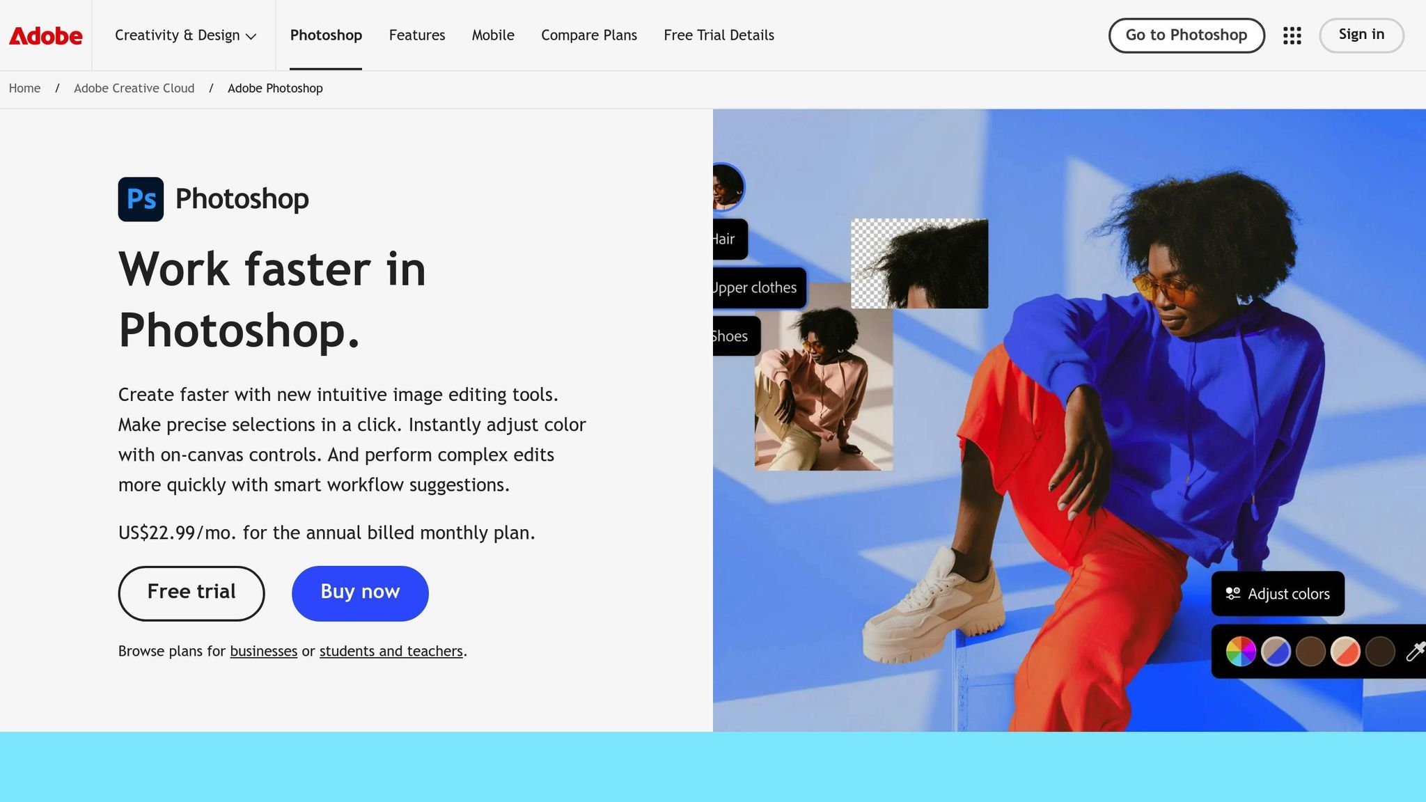
Fixing Smart Objects in Photoshop 🔥
Template Compatibility Problems
When working with templates, differences between Photoshop and Photopea can lead to unexpected issues. While Photopea does a solid job of imitating Photoshop's interface, it can't fully replicate the advanced features that modern templates rely on. These gaps often impact smart objects and font rendering, creating challenges that disrupt design accuracy and slow down projects.
Photoshop-Only Features in Templates
Smart objects are one of the biggest culprits behind compatibility problems. In Photopea, smart objects that depend on embedded PSD files or advanced blending options might not work at all, leaving them completely uneditable.
Layer effects also pose significant hurdles. Effects like bevel & emboss, gradient overlays, and custom blending modes, which look polished in Photoshop, may behave unpredictably in Photopea.
Another frequent issue comes from non-standard adjustment layers. Similarly, vector objects created in Adobe Illustrator or processed through Camera Raw often face compatibility problems because Photopea doesn’t natively support these Adobe-specific formats.
The consequences of these limitations go beyond mere visual inconsistencies. If smart objects fail to load correctly, you lose the ability to quickly update designs or make simple edits. This undermines the entire purpose of using mockup templates, which are supposed to simplify your workflow.
Font and Effect Differences
In addition to smart objects, text and effects often don't translate seamlessly between the two programs. For example, when Photopea can't locate the original font used in a Photoshop template, it substitutes it with a different font. This can disrupt text spacing, size, and overall alignment, forcing you to manually adjust everything to match the intended design.
Blending modes are another tricky area. Modes like "Color Dodge" or "Linear Light" often behave differently in Photopea, altering how layers interact visually. A subtle shadow or highlight in Photoshop might appear too harsh - or barely noticeable - in Photopea, which can drastically change the final look of your design.
File Format and Resolution Problems
When it comes to creating professional mockups, technical file specifications are just as important as compatibility. Decisions around resolution, file format, and transparency can make or break the quality of your designs - whether for print or high-quality digital displays. Let’s dive into how these factors influence your mockup results.
Picking the Right Resolution
Matching your resolution to the intended output is essential. For screens, 72 DPI is standard, while printers demand 300 DPI for sharp, detailed results. A design that looks crisp on a screen might appear pixelated when printed if the resolution isn’t up to par.
For smaller items, aim for a resolution of at least 150 DPI, though 300 DPI is ideal. When working on apparel mockups, use images with a minimum size of 2,000x2,000 pixels to maintain clarity and detail across various output sizes. This ensures that your designs stay sharp, regardless of the platform or medium.
Keep in mind that increasing resolution beyond 300 DPI doesn’t improve quality; it only creates unnecessarily large files that slow down your workflow. For most professional apparel mockups, 300 DPI hits the sweet spot - balancing quality and efficiency.
To check your resolution in Photoshop, go to Image > Image Size and review the resolution setting. If it’s already at 300 ppi, your design is print-ready. Taking this quick step can save you from costly resolution issues later.
Vector vs. Raster Format Differences
Understanding the difference between vector and raster formats is key to delivering polished mockups. Vector files, such as SVG and AI, use mathematical formulas to define shapes, making them infinitely scalable without losing sharpness. On the other hand, raster formats like PNG and JPEG are made up of pixels, which can blur or pixelate when enlarged.
This distinction is particularly important for elements like logos or text. For example, a company logo saved as a low-resolution JPEG will look blurry on a large hoodie mockup. However, that same logo saved as a vector file will remain crisp and professional at any size.
To maintain quality, keep your elements in vector format for as long as possible. Only convert to raster when applying effects or finalizing the design. Vector files are usually smaller and load faster than high-resolution raster images, though extremely detailed vector artwork can sometimes slow rendering due to the number of anchor points involved.
Transparency Problems
Transparency issues, particularly with PNG files, can sneak up on you. Semi-transparent pixels in PNGs often create unwanted halos or artifacts when placed over textured backgrounds or complex patterns. This happens because anti-aliasing in image editing software generates semi-transparent edges that can pick up unintended colors.
This problem is especially noticeable in designs with white or light-colored elements on dark apparel mockups. A clean white logo might end up with a grayish halo around the edges, giving the design an unpolished look. To avoid this, pay close attention to how you handle transparency. Instead of relying solely on automatic anti-aliasing, create hard edges or use masking techniques to control transitions more precisely.
If you’re using print-on-demand platforms, always check their specific requirements for resolution and transparency. Many platforms have strict guidelines to ensure your designs look their best on finished products.
Finally, remember that low-resolution images can make your mockups appear blurry or pixelated, which can damage your brand’s image. By mastering these file format essentials, you’ll be better prepared to tackle related challenges, like color mode issues, in your designs.
Color Mode and Profile Mismatches
Color mode issues can seriously affect the accuracy of your mockups. Just like other template-related challenges, mismatched color profiles can throw off your design’s fidelity. What looks vibrant and perfect on your screen might appear dull or entirely different when printed. This happens because many templates are built for digital use but aren’t always optimized for physical production.
RGB vs. CMYK Mix-ups
The root of the problem lies in the difference between RGB and CMYK color modes. RGB is designed for digital screens, while CMYK is tailored for print. This distinction means that the bright, saturated colors you see in an RGB design may not translate well into CMYK.
Most templates default to RGB since they’re intended for digital use. However, when an RGB file is sent to print, it’s automatically converted to CMYK. This conversion often results in noticeable color shifts. For example, an electric blue in RGB might turn muddy, or a vibrant red could darken significantly in CMYK.
According to Adobe’s documentation, around 80% of color-related complaints in print jobs come from incorrect color modes or missing color profiles. This issue is especially critical for apparel mockups, where maintaining accurate brand colors is essential. A design that looks flawless on screen might not match the final printed product, leading to dissatisfaction.
Certain colors - like neon hues, highly saturated blues and greens, and vivid magentas - are particularly prone to dramatic changes during RGB-to-CMYK conversion. Photoshop generally handles these transitions better than Photopea, thanks to its advanced color management tools and superior preview options. While Photopea does support both RGB and CMYK, its more limited features can make predicting print results trickier. This makes deliberate color management a must during the design process.
Tips for Color Accuracy
To avoid these issues, here are some practical tips for maintaining color accuracy:
- Start your design in CMYK mode, using the "U.S. Web Coated SWOP v2" profile. In Photoshop, you can assign this profile by navigating to Edit > Assign Profile. In Photopea, you’ll find similar options in the program’s preferences.
- Use soft proofing to preview how your colors will look when printed. Both Photoshop and Photopea will notify you if a chosen color is outside the CMYK gamut.
- If you need to use bright, saturated colors, consider alternatives like spot colors or Pantone matching instead of relying on CMYK conversions alone.
- Regularly calibrate your monitor to ensure what you see on screen closely matches the printed output. Also, confirm file requirements with your print provider to avoid costly reprints.

For apparel mockups, it’s a good idea to test your colors on the actual fabric or material. Different textiles absorb and reflect colors differently, which can impact the final look. Additionally, think about the lighting conditions where your product will be viewed - colors can appear vastly different under fluorescent lights compared to natural daylight.
For a smoother workflow, consider using tools with built-in color profiles. For example, Pixel Sauce (https://pixelsauce.co) offers a library of high-resolution Photoshop mockup templates designed to help your designs look polished and professional, whether on screen or in print.
Layer and Smart Object Problems
Smart objects are the backbone of mockup templates, but when they're not set up correctly, they can throw a wrench into your design process. These issues become even more challenging when you're juggling multiple templates or trying to streamline your workflow with automation.
Broken or Missing Smart Objects
One of the most frustrating roadblocks in mockup templates is dealing with broken or missing smart objects. When these elements are corrupted or absent, editing becomes a headache, and your workflow grinds to a halt.
The root of the problem often lies in how the smart object was initially created. Some template designers save smart objects as PNG files instead of PSD files. This choice limits your ability to edit and can slow down performance when using the "Edit Smart Object" feature. In batch processing, automation can fail if replacement folders (like obj0, obj1) are misnamed or missing altogether.
To avoid these pitfalls, smart objects need to be set up correctly, and layers must be well-organized.
Layer Organization for Better Workflow
Disorganized layers can make editing a nightmare. They waste time, increase the risk of accidental edits, and can even damage the structure of your template.
To work more efficiently, organize your layers with clear and descriptive names. Group related elements together so you can find what you need quickly. Locking layers that don't need editing is another simple way to prevent mistakes.
For team projects, maintaining a consistent layer structure is key. If you're working across platforms like Photoshop and Photopea, keep things simple. Stick to PSD-based smart objects and avoid using features that only work in Photoshop. Always save smart objects as PSD files to ensure full editing capabilities, and create them directly in Photoshop to sidestep compatibility issues with externally linked files.
If you're looking for mockup templates that are already structured to avoid these common headaches, check out Pixel Sauce (https://pixelsauce.co). They offer over 6,000 high-resolution Photoshop mockup templates, all designed with proper layer organization and smart object setups to save you time and frustration.
sbb-itb-23fab5f
Performance and Speed Issues
Working with high-resolution mockup templates and intricate designs can significantly slow down performance, especially in browser-based editors like Photopea. Let’s break down why this happens and how to address it.
Slow Loading in Photopea
Photopea's reliance on your browser and device memory makes it vulnerable to performance hiccups when handling large or complex templates. If your mockup exceeds 100 MB, contains over 50 layers, or includes high-resolution images, adjustment layers, and complex smart objects, your browser’s RAM can quickly get overwhelmed. This often results in freezing or unresponsive tools.
One major culprit? PNG files embedded as smart objects. These can cause noticeable delays in loading and editing.
To improve performance in Photopea:
- Close unused tabs to free up memory.
- Lower the resolution of your images when possible.
- Rasterize non-editable smart objects to reduce processing demands.
- Use a lightweight browser and save your work frequently to avoid losing progress in case of a crash.
Workflow Slowdowns
The performance issues don’t stop at loading times. When working with multiple large templates, overall workflow efficiency can take a hit.
Memory usage spikes as more files are opened simultaneously. This can slow down basic tasks like applying filters, making adjustments, or navigating between files.
To streamline your workflow:
- Preprocess images to match your template’s specifications before starting batch operations.
- Use the "Replace Content" feature instead of "Edit Smart Object" to conserve resources.
- Organize templates by size and complexity. Opt for simpler templates for quick projects and save high-resolution designs for when you have plenty of time and system capacity.
Another tip? Convert PNG smart objects to PSD files. This can make a big difference in performance, especially if you frequently use the "Edit Smart Object" function.
For those seeking mockup templates that balance quality and efficiency, check out Pixel Sauce (https://pixelsauce.co). They offer over 6,000 high-resolution templates designed with organized layers and smart object setups to minimize performance issues while maintaining professional-grade flexibility.
Solutions and Fixes
Now that we've pinpointed the key challenges, let’s dive into practical ways to make your templates perform better while sidestepping common mistakes.
Making Templates Work Better
To address compatibility issues, focus on optimizing your templates. Start by converting files to the correct format - saving them as PSD files can significantly reduce memory usage. Pay attention to resolution: use 72–150 DPI for web designs and scale up to 300 DPI for print projects. Simplify your templates by flattening unnecessary layers and merging similar elements, which lightens the processing load. For smart objects, avoid overly complex nested structures. Instead, flatten inner elements and keep only the main design area editable as a smart object.
Keeping Colors Accurate for Print
Ensuring color accuracy begins with proper color profile management. If you're designing for print, always switch to CMYK mode, even if the original template is in RGB. This helps avoid unexpected color shifts. In Photoshop, use the "U.S. Web Coated (SWOP) v2" profile under Color Settings, which is suitable for most commercial printing needs. If you're using Photopea, manually convert to CMYK and fine-tune the colors for similar results.
Before finalizing your design, test your colors. Print a small sample on the intended material or use online color viewers to preview how the colors will appear. Create a reference sheet listing your brand's RGB and CMYK values, and keep Pantone codes handy for consistency across projects. These steps not only improve color accuracy but also streamline your workflow.
Using High-Quality Mockup Libraries
Pairing optimized templates with high-quality mockup libraries can address both performance and compatibility concerns. Look for libraries specifically designed to work seamlessly with Photoshop and Photopea.
For example, in October 2024, Jenevieve Womack shared her experience with the "Kitchen Wallpaper Mockup Template - Kitchen Tile Backsplash Mockup - Photoshop Wallpaper Mockup - Photopea Wallpaper Mockup" from UpHerSlv. She noted that it "worked like a charm in Photopea", proving that well-crafted templates can function smoothly across platforms.
One excellent resource is Pixel Sauce (https://pixelsauce.co), which offers over 4,500 high-resolution mockup templates. These templates are thoughtfully designed with organized layer structures, accurate color libraries, and optimized smart object setups to reduce performance issues. When choosing a mockup library, prioritize those that provide PSD files with clear instructions, color swatches, and sizing guidelines. This attention to detail can save you time and ensure a more efficient workflow.
![]()
Conclusion
Using Photoshop and Photopea templates doesn't have to be a headache. While Photoshop supports all advanced features, Photopea has its limits with things like complex smart objects and certain layer effects. Knowing these differences ahead of time can save you a lot of troubleshooting and frustration. A clear understanding of these platform constraints helps you prepare files correctly for smooth and error-free results.
Proper file preparation is key. For instance, converting PNG smart objects into PSD format can make a noticeable difference in performance, and managing resolution carefully ensures your designs look polished. Addressing potential issues like color accuracy and performance early on keeps your workflow running smoothly.
The way you organize smart objects also plays a big role in your efficiency. Templates with broken or overly complicated nested layers can slow you down, while those with well-structured layers and clear naming conventions make the design process faster and more intuitive. Organized smart objects are essential for making the most of high-quality mockup libraries.
Speaking of mockup libraries, choosing the right templates can solve many problems before they even arise. For example, Pixel Sauce offers a collection of over 6,000 high-resolution mockup templates designed with compatibility and performance in mind. These templates feature organized layers, precise color libraries, and optimized smart objects, making them easy to use across different platforms. With well-designed templates, you can focus on creating instead of fixing.
To streamline your workflow, stick to high-quality templates and follow best practices for file preparation. Ensure compatibility with your software, prepare replacement images correctly, and manage colors consistently. By doing so, you can turn template work into a smooth, professional process that delivers reliable and impressive results for your apparel designs.
FAQs
How can I make sure my Photoshop templates work smoothly in Photopea?
To make sure your Photoshop templates work seamlessly with Photopea, save them in commonly supported formats like PSD. While Photopea is built to manage the majority of Photoshop's features, some advanced elements - like specific smart objects or layer effects - might not display as intended.
To avoid complications, organize your layers neatly and steer clear of features exclusive to the latest Photoshop versions. It’s also a good idea to test your template in Photopea before wrapping things up. This way, you can catch any potential issues early and ensure everything functions smoothly.
How can I avoid color issues when converting designs from RGB to CMYK for printing?
When converting designs from RGB to CMYK, it’s crucial to take steps to maintain accurate colors. Start by working on a calibrated monitor, which ensures the colors you see on-screen are as true-to-life as possible. Also, make sure to enable color management settings in your design software to keep colors consistent throughout your workflow.
Before wrapping up your project, use soft proofing to preview how your colors will look in CMYK. This allows you to catch and fix any potential issues before printing. Lastly, double-check that your color profiles and separations match the printer’s specifications. Following these steps can help reduce surprises and keep your printed designs looking as intended.
How can I organize layers and smart objects in Photoshop and Photopea to work more efficiently?
Tips for Staying Organized in Photoshop and Photopea
Keeping your layers and smart objects tidy can do wonders for your workflow in Photoshop and Photopea. Start by giving your layers clear, descriptive names - this helps you instantly understand what each layer represents. Group related elements together to keep things structured, and use color-coding to quickly spot important sections of your design. These small steps make navigating even the most complex projects a lot smoother.
When it comes to smart objects, proper labeling and logical organization are key. Smart objects are a fantastic tool for non-destructive editing, letting you tweak elements without messing up your original design. Take full advantage of this flexibility by keeping everything neatly arranged. Staying organized not only saves time but also helps you avoid unnecessary headaches while working on your creative projects.