
 Log in


Creating apparel mockups can save time and money, but small mistakes can ruin their impact. Here are 10 common errors to avoid:
- Poor Image Quality: Use high-resolution templates (4000x4000px, 300 DPI) to avoid pixelation and blurriness.
- Wrong Fabric Appearance: Match textures and folds to the actual fabric (e.g., cotton, fleece).
- Incorrect Design Position: Align designs properly (e.g., centered, proportional).
- Inaccurate Colors: Use consistent color profiles (CMYK for print, RGB for digital).
- Poor Lighting Effects: Adjust shadows and highlights for realism.
- Distorted Garment Sizes: Maintain accurate proportions to reflect real-life sizing.
- Missing Garment Features: Include details like seams, pockets, and hems.
- Bad Background Choice: Use clean, simple backgrounds that enhance your design.
- Mixed Brand Elements: Keep logos, colors, and typography consistent.
- Not Mobile-Ready: Optimize mockups for mobile viewing with high resolution and proper scaling.
Quick Tips for Better Mockups:
- Use layered PSD files with smart objects for easy editing.
- Test designs on different devices and lighting conditions.
- Stick to brand guidelines for consistency.
Fixing these mistakes ensures your mockups look polished, realistic, and professional.
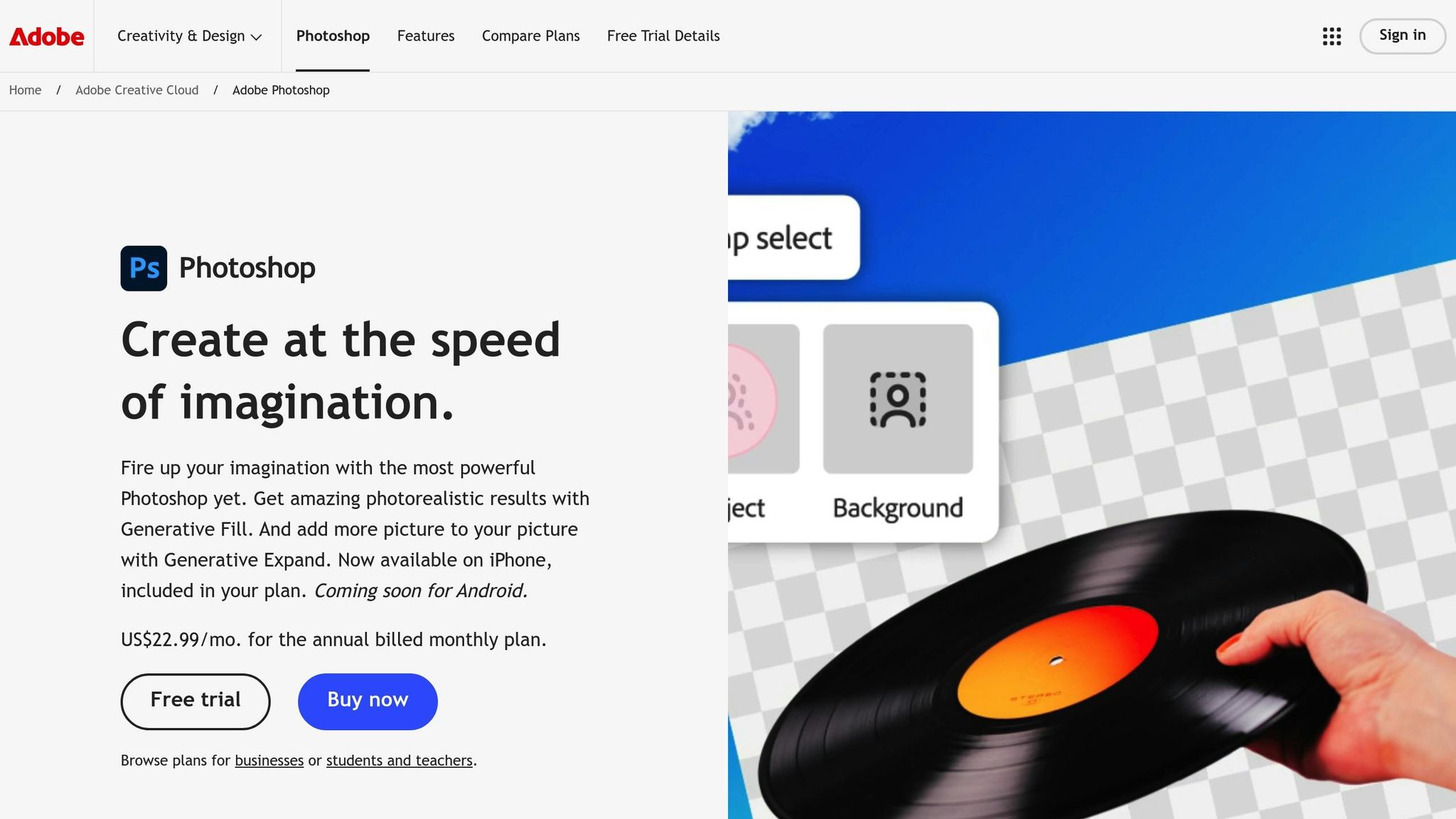
Easily Create Realistic T-Shirt Mockups in Photoshop
1. Poor Image Quality
The quality of your images plays a huge role in how professional your mockups look. High-resolution images are key to keeping your apparel mockups sharp and detailed. Templates with a resolution of 4000x4000px help prevent pixelation, blurriness, and the loss of fine details.
Here’s what can go wrong with low-quality images:
- Pixelation: Design elements appear jagged and distorted when scaled.
- Blurriness: Text and intricate patterns lose their sharpness.
- Poor scaling: Images degrade on high-resolution screens.
- Loss of detail: Fine elements of your design may look muddled or completely disappear.
![]()
To avoid these issues, always check your image resolution at 100% to ensure that logos, text, and patterns are clear and well-defined.
Pro tip: Use smart object layers when customizing mockups. This method lets you edit your designs without sacrificing quality, keeping them sharp even after multiple revisions.
Here are the technical specs you should aim for:
| Aspect | Recommended Minimum |
|---|---|
| Resolution | 4000x4000px |
| DPI | 300 |
| File Format | Layered PSD |
| Color Mode | RGB |
Getting your image quality right is a critical first step to creating polished and professional mockups.
2. Wrong Fabric Appearance
Getting fabric textures and draping effects right is essential. The way fabric behaves - how it folds, hangs, and interacts with light - varies depending on the material. Here's a breakdown of common fabric types, their characteristics, and frequent mistakes:
| Fabric Type | Key Characteristics | Common Mistakes |
|---|---|---|
| Cotton Jersey | Soft draping, subtle wrinkles | Overdone folds; fabric looks too stiff |
| Fleece | Thick texture, structured draping | Missing texture; fabric appears too smooth |
| Performance Material | Sleek surface, minimal folds | Unnatural wrinkles; incorrect shine |
| Heavy Cotton | Defined folds, matte finish | Draping looks too fluid; weight poorly represented |
The realism of your mockup depends on understanding how fabric properties influence folds and textures. Key factors include:
- Natural fold points: Areas like shoulders, underarms, and waistlines where fabric naturally gathers.
- Garment fit: Tight garments show fewer folds, while looser ones display more.
- Material weight: Heavier fabrics create deeper, more pronounced folds.
- Surface texture: Each material reflects light differently, affecting its overall look.
![]()
When working with fabric textures, tweak blend modes and opacity settings for a realistic result. For instance, use 'Linear Light' to bring out cotton textures or 'Overlay' to replicate the sheen of performance materials.
Pro tip: Spend time observing real garments under different lighting conditions. This will help you understand how shadows and highlights interact with various fabrics, making your mockups more lifelike.
3. Incorrect Design Position
The placement of your design plays a big role in the overall quality of your mockup. Poor positioning can lead to a misleading representation of how the final product will look. Here’s what you need to know to make sure your design placement is spot-on.
Common Design Areas and Placement Tips
| Design Area | Recommended Placement | Common Mistakes |
|---|---|---|
| Left Chest | Position the logo or artwork on the upper left chest, just below the shoulder seam for a balanced appearance. | Placing it too high near the collar or too far to the side. |
| Full Front | Center the design on the chest with equal margins from the collar for a proportional look. | Designs that are off-center, too low, or lack balanced margins. |
| Back Design | Place the design squarely in the center of the back, aligned with the garment’s natural lines. | Misalignment with the center or not accounting for the back’s natural curve. |
| Sleeve Print | Position the design near the shoulder seam to fit the sleeve’s natural shape. | Leaving the placement blank or misaligned. |
Key Guidelines for Proper Placement
- Center Alignment: Use the vertical and horizontal guides in your design software to ensure the design is perfectly centered. This is especially crucial for full front and back prints.
- Proportional Scaling: Adjust the size of your design to fit different garment sizes. Larger shirts require appropriately scaled designs compared to smaller ones. Always double-check printer specifications.
- Natural Flow: Pay attention to garment features like seams, zippers, or pockets. Make sure your design integrates smoothly with these details.
Additional Tips for Advanced Designs
1. Print Area Boundaries
Define a print zone that follows the garment’s shape, ensuring the design feels balanced and cohesive.
2. Size Consistency
Keep design elements proportional across various product sizes. Scaling should always match the garment dimensions.
3. Template Alignment
Use alignment tools and review multiple garment views to confirm consistency across the entire design.
Pro Tip: Before finalizing your mockup, zoom in and out, and test it on different backgrounds. This can help you catch alignment or scaling issues you might otherwise miss.
4. Inaccurate Colors
Getting colors right is crucial for your mockups to truly represent your brand's aesthetic. When colors don't translate properly from screen to the final product, it can confuse customers and damage trust in your designs.
![]()
Understanding Color Systems
| Color System | Best For | Benefits |
|---|---|---|
| CMYK | Print Production | Standard for accurate color printing |
| PMS (Pantone) | Brand Colors | Consistent color matching across materials |
| RGB | Digital Display | Ideal for screens and web |
Each system serves a specific purpose, so knowing when to use them is key. Below, we’ll explore common color-related issues and how to fix them.
Common Color Mistakes and Solutions
-
Inconsistent Color Libraries
Colors can look different depending on the material. For example, a bright red on glossy paper may appear muted on cotton. -
Material-Specific Color Adjustments
Fabrics can alter how colors appear. Navy blue, for instance, often looks lighter on cotton compared to polyester blends. -
Monitor Calibration Issues
Monitors can display colors inaccurately if not calibrated regularly. Check your designs under various lighting conditions to ensure consistency.
Best Practices for Accurate Colors
Fixing these issues requires sticking to proven methods.
Color Measurement Guidelines
- Stick to standardized CMYK or PMS systems.
- Document exact color codes for reference.
- Test colors in various conditions and on different materials.
- Use tools like Pixel Sauce's integrated color libraries for uniform results.
Digital Color Management
- Work with high-resolution files (at least 4000x4000px).
- Apply consistent color profiles across all designs.
- Use layered editing to make precise adjustments.
Professional Color Tips
Brand Colors:
- Develop a dedicated color palette for your brand.
- Test your brand colors on different devices and materials to ensure consistency.
- Keep a detailed record of all color codes.
Leverage Pixel Sauce's tools to maintain consistent colors in your mockups. Accurate colors not only strengthen customer trust but also help avoid costly production mistakes while reinforcing your brand identity.
5. Poor Lighting Effects
Lighting plays a key role in how realistic and appealing your apparel mockups look. Poor lighting can make your designs appear less lifelike and even misrepresent your products to potential buyers.
Why Lighting Matters
Good lighting ensures that apparel details and textures are shown accurately. When lighting is handled poorly, it can lead to several common problems:
| Lighting Issue | Impact | Solution |
|---|---|---|
| Inconsistent Shadows | Makes products look unrealistic | Align shadow direction with light source |
| Overexposure | Hides fabric texture details | Adjust highlight intensity |
| Underexposure | Makes features too dark to see | Increase brightness without losing contrast |
| Artificial Highlights | Creates unnatural results | Use proper light placement and intensity |
To achieve natural lighting effects, focus on precise layer adjustments and attention to detail.
How to Create Realistic Lighting
Working with layered files allows you to fine-tune lighting for a professional finish. Here’s how you can improve your mockups:
Managing Shadows
- Use separate layers for different types of shadows.
- Adjust the opacity to match the intensity of the light source.
- Keep shadow directions consistent across all views of the product.
Controlling Highlights
- Apply subtle highlights to bring out fabric textures.
- Avoid overexposed areas that wash out details.
- Position highlights to mimic natural light.
Advanced Lighting Tips
For even better results, it’s important to understand how different fabrics interact with light. Natural and balanced lighting often works best for fashion mockups.
Light Source Tips
- Stick to a single primary light source and ensure natural reflections to maintain a balanced look.
Fabric-Specific Adjustments
- Matte fabrics need softer, more diffused shadows.
- Glossy materials benefit from sharper, more pronounced highlights.
- Textured fabrics require extra attention to shadow details to showcase their depth.
Using high-resolution templates, like those from Pixel Sauce, can give you precise control over shadows and highlights, helping you nail the lighting setup from the start and save time on edits later.
sbb-itb-23fab5f
6. Distorted Garment Sizes
Getting garment proportions right is crucial for building trust with customers and cutting down on costly returns. When sizes are distorted, it creates a misleading impression that can hurt your brand's reputation.
Impact of Size Distortion
Distorted sizing in mockups can cause a range of problems:
| Problem | Business Impact | Customer Impact |
|---|---|---|
| Incorrect Scale | Higher return rates | Hesitation to purchase |
| Unrealistic Fit | More customer complaints | Erosion of trust |
| Inconsistent Proportions | Increased operational costs | Negative reviews |
| Misrepresented Details | Harm to brand reputation | Confusion about sizing |
Addressing these issues requires precise proportion techniques in your mockups.
How to Achieve Accurate Proportions
To ensure your mockups reflect accurate sizing, focus on these essentials:
- Vector-Based Templates: Use vector-based mockups to keep proportions correct, no matter the scale.
- Size Chart Integration: Incorporate chest width, length, and sleeve measurements in both inches and centimeters for clarity.
- Technical Specifications: Opt for high-resolution templates (e.g., 4000x4000px) to maintain sharpness and accurate proportions in all design elements.
Fine-Tuning for Specific Garments
Beyond basic accuracy, tailoring your mockups to specific garment styles can make a big difference.
T-Shirts and Tanks
- Keep shoulder-to-hem ratios consistent.
- Match sleeve lengths to the actual product.
- Ensure necklines align with the real design.
Hoodies and Sweatshirts
- Verify pocket placement is correct.
- Maintain hood dimensions.
- Align drawstring and cuff sizes with the actual garment.
Pro Tip: Work in Layers
Use separate layers for different garment components. This lets you adjust individual elements - like sleeves or pockets - without impacting the overall proportions. A layered approach ensures every detail looks right across all product views.
7. Missing Garment Features
Leaving out important garment details can hurt the trust customers place in your brand and make your designs feel incomplete.
Key Garment Details
Every type of clothing has unique features that need attention:
| Garment Type | Key Features | Impact on Design |
|---|---|---|
| T-Shirts | Collar ribbing, sleeve hems, side seams | Affects how designs are placed and scaled |
| Hoodies | Kangaroo pockets, drawstrings, hood seams | Impacts artwork positioning |
| Tank Tops | Armholes, binding, shoulder straps | Defines the visible design area |
| Sweatshirts | Cuff ribbing, waistband, shoulder panels | Shapes the overall design look |
Highlighting these features ensures your designs are presented clearly and professionally.
Multiple View Displays
Pixel Sauce’s 8-view system is perfect for showcasing every aspect of your garment:
- 4 front views and 4 back views provide a complete look at all garment components.
![]()
Seamless Design Integration
Incorporating garment features into your mockups strengthens the overall presentation and adds credibility to your designs.
Structural Details
- Factor in seam placement and stitching patterns.
- Include hardware like zippers and buttons.
- Account for natural fabric folds and curves.
Technical Accuracy
- Use layered templates to align features precisely.
- Keep the scale consistent across all views.
- Make sure designs don’t cover important garment details.
Tips for a Professional Look
For the most realistic and polished mockups:
- Start with high-quality templates.
- Note all key garment features before adding your designs.
- Double-check that hardware and trims are clearly visible.
- Ensure consistent representation of features across all sizes.
Accurately showcasing garment details not only enhances customer confidence but also helps reduce return rates by setting clear expectations for the final product.
8. Bad Background Choice
The background you choose can make or break the professionalism of your mockup. Even the best designs can lose their impact if paired with a poorly selected background.
How Backgrounds Affect Visual Presentation
The background plays a crucial role in several aspects of your mockup:
| Background Element | Effect on Mockup | What to Do |
|---|---|---|
| Contrast | Influences how visible your design is | Pick backgrounds that enhance garment colors |
| Texture | Adds realism and depth | Opt for natural textures like wood or concrete |
| Lighting | Creates dimensional effects | Use shadow kits with adjustable opacity for realistic results |
| Scene Context | Sets the tone for product use | Choose backgrounds that match the intended purpose |
Elements of a Professional Background
A well-chosen background combines high-quality textures, natural materials, and balanced lighting for a polished look.
Natural Materials to Use
- High-resolution terrazzo patterns
- Premium wood grains
- Polished concrete textures
- Classic marble finishes
- Modern tile designs
Lighting Tips
- Use shadows with adjustable opacity to add depth
- Incorporate realistic reflections for authenticity
- Ensure consistent lighting direction
- Add natural ambient shadows for a polished effect
Common Background Mistakes to Avoid
Certain errors can ruin the overall look of your mockup. Be mindful of these issues:
Distracting Elements
- Overly busy patterns that pull focus from the design
- Mismatched or inconsistent lighting
- Shadows that look out of place
- Clashing colors between the background and the garment
- Low-resolution textures
Technical Errors
- Pixelated or blurry background images
- Incorrect perspective or angles
- Scale mismatches between the background and the product
- Shadows that appear artificial
By steering clear of these mistakes, your background will blend seamlessly with your design.
Tips for Optimizing Backgrounds
Pixel Sauce offers tools to help you fine-tune your backgrounds with ease. Follow these tips for a professional finish:
Scene Setup Tips
- Test your design with several background options to find the best fit
- Keep lighting consistent across all product views
- Adjust shadow intensity to align with the environment
- Scale background textures to fit the mockup proportionally
- Ensure the background enhances the garment rather than overpowering it
9. Mixed Brand Elements
Consistent branding can increase revenue by up to 33%. Pixel Sauce's templates help you achieve this by ensuring logos are positioned consistently, colors are accurate, and scaling remains uniform. This approach strengthens your brand identity and aligns with the high standards mentioned earlier.
On the flip side, inconsistent branding can hurt your credibility. Designer Rosanna puts it perfectly:
"Having a confusing brand with little consistency, or too many sub-brands that all look different, adds a mental barrier for your customers".
| Brand Element | Common Mistakes | Best Practices |
|---|---|---|
| Logo Placement | Varying positions across products | Stick to fixed positions for each garment type |
| Color Palette | Using colors outside the approved scheme | Follow the approved brand color libraries |
| Typography | Mixing multiple font styles | Use only the designated brand fonts |
Key Areas to Check for Brand Consistency
Visual Identity Elements
- Accurate brand colors
- Consistent logo placement and scaling
- Adherence to typography guidelines
- Uniform background styles
- Consistent lighting and shadows
These checks ensure your brand identity stays cohesive and professional.
Building a Workflow for Brand Consistency
Before You Begin
- Develop a detailed brand style guide
- Set up color libraries that match your brand
- Use pre-approved mockup templates
- Establish lighting presets for uniformity
Quality Control Steps
- Compare mockups with approved templates
- Test for compatibility on mobile displays
- Double-check that all brand elements align
10. Not Mobile-Ready
Making sure your mockups are optimized for mobile devices is just as important as using high-resolution images and precise design placement. If your designs don't look good on all screen sizes, you risk losing impact.
Common Mobile Display Issues
| Issue | Impact | Solution |
|---|---|---|
| Image Resolution | Blurry or pixelated images on high-DPI screens | Use templates sized at 4000x4000px for sharp visuals |
| Load Time | Slow loading can drive users away | Reduce file sizes without losing quality |
| Scaling Problems | Designs appear too small or too large | Test mockups on various device sizes |
| Color Accuracy | Colors look different across devices | Use templates with calibrated colors |

Device-Specific Considerations
High-DPI devices require sharp, clear images that maintain quality across different pixel densities. Your mockups should adapt seamlessly to these variations to ensure a consistent appearance on any screen.
Testing Best Practices
To avoid mobile display problems, use these practical testing steps:
- Preview Across Devices: Test how your mockups look on both iOS and Android devices.
- Check Orientation: Ensure designs work well in both portrait and landscape views.
- Verify Details: Confirm that small text and intricate elements remain sharp and readable when zoomed in.
Resolution Requirements
For the best mobile display results:
- Minimum Resolution: 2000x2000px (Recommended: 4000x4000px)
- File Format: Layered PSD with smart objects
- Color Space: Use sRGB for consistent colors across devices
Mobile-First Design Tips
When designing for mobile users, keep these tips in mind:
- Make sure important elements are visible even at smaller sizes.
- Use fonts and text sizes that remain legible on small screens.
- Test loading speeds under typical mobile network conditions.
- Check color consistency across different device displays.
Conclusion
Creating professional apparel mockups requires attention to detail and the right tools to bring your designs to life before production. This process not only sharpens your visuals but also builds trust with your audience.
High-quality mockups ensure design consistency and make revisions smoother. With clear, high-resolution images that look great on any platform or device, you can confidently showcase your work to potential customers and clients.
Why Quality Mockups Matter
| Aspect | Professional Result | Business Benefit |
|---|---|---|
| Image Resolution | Clear and detailed product views | Boosts customer confidence |
| Color Accuracy | Realistic color representation | Reduces returns and complaints |
| Mobile Optimization | Consistent display across devices | Expands your audience reach |
| Smart Object Integration | Easy design updates | Speeds up time-to-market |
These areas highlight how quality mockups can positively impact your business.
"Save Time, Money & Hassle with the Best Mockups. Simple & easy to use clothing mockups for Photoshop. Create better product images for your brand today." – Pixel Sauce
By focusing on image quality, accurate fabric representation, proper design placement, and mobile-friendly optimization, you can create mockups that enhance your brand's professional image. Using reliable tools like Pixel Sauce's templates ensures your visuals remain polished and consistent.
![]()
Tips for Staying Consistent
Keep your mockups professional by:
- Testing designs on various devices
- Sticking to approved brand colors
- Choosing high-resolution templates
- Regularly updating your mockup resources